Participants Database provides a variety of different field types (known as the field’s “Form Element”) that you can use in your forms and displays. Each one has specific ways of displaying and storing data. It is also possible for other plugins to define new field types.
The form element type is determined in the field definition, which is configured on the Manage Database Fields page. When a new field is created, the type is selected at that time, but you can change the form element in the field definition at any time.
Bear in mind that the field type determines how the data is stored in the database, so it is possible to lose data when changing the form element type. It is best to avoid changing the form element type of a field once it has started storing data. You will be warned if you try it.
Form Element Type Descriptions and Usage Notes
Text Line
Simple text field, limited to 255 characters.
Text Area
A simple textarea box with a character limit of 65,000.
Rich Text
This presents a text editor box like the “classic editor” used to edit content in WordPress pages and posts. The rich text editor will only be shown on the frontend if allowed in the settings (the “Use Rich Text Editor” setting under the Advanced tab).
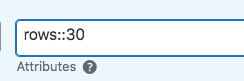
editor height to 30 rows
You can set the height of the editor using the “rows” attribute in the field definition. Each row is (approximately) one line of text. The default is 20, so at that height, the user will be able to type in about 20 lines of text without scrolling. For the best UI, set this to a height that will accommodate the amount of text most users will be typing in for the field you are creating.
If you are having problems with the display of this field, Check the “Use WP auto format” setting (also under the plugin settings advanced tab), which determines how the content of the rich text field will be processed before display.
The default is to use the “the_content” filter, which is the global filter used by all WordPress posts and will provide auto paragraphs and process shortcodes. You can use this setting to control how WordPress and other plugins affect the rich text content. The “the_content” filter is commonly used by other plugins that alter or add content, so there may be some unintended effects. To prevent other plugins from altering the displayed content of the field, try using the “auto-paragraphs + shortcodes” setting.
Date Field
This is a field specifically for date values. Dates entered as text will be converted to a UNIX timestamp for storage. You must use this field type for dates if you want date searches and sorts to work correctly.
To set an initial date value, set the “Default” to a dynamic date key like “current_date.”
Date Display Formatting
The date field’s display will normally be formatted according to your WordPress site settings, but you can set the format for a specific date field in the Attributes setting in the field configuration. To enable the display of the time with the date, you can use the mode attribute, like this: mode::time This will use the WP global time format.
You can set a specific format for the field with the “format” attribute. The format string is the standard php date formatting codes. Check the link for what you can use there. This includes enabling the display of the time with the date.
Since the date field stores its value as a timestamp, you can change the display format without changing the values that are stored. The date format simply interprets the stored timestamp to give you the readable date.
For example, to show only the year of a date field, set the attributes to “format::Y”.
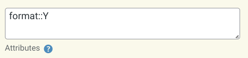
There are, of course, many possibilities when using date format strings.
Date fields can have their UI enhanced with the Datepicker Add-On.
Checkbox
A single checkbox that may have one or two values, the second value represents the “unchecked” value for the field. If there is no second value defined, the “unchecked” value will be saved as an empty string.
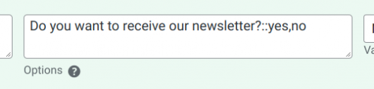
You can use the option to label the checkbox. With the setting shown here, the word “yes” will be stored if the checkbox is checked, “no” if it is unchecked.
The second (unchecked) value is not displayed, and does not use a label.
This field type uses the Options attribute to define its values.
Radio Buttons
For showing several choices, only one of which may be selected. This is better UI than a dropdown for a small number of choices because all the choices are visible.
This field type uses the Options attribute to define its options.
Radio Buttons/Other
Shows radio buttons with the addition of an “other” button and text input.
This field type uses the Options attribute to define its options.
Dropdown List
This is the familiar dropdown selector control, allowing only one item to be selected at a time. This is better for long lists of options.
This field type uses the Options attribute to define its options.
Dropdowns can have their UI enhanced with the use of the Chosen Selector add-on. This is especially helpful for very long lists of options because the user interface has a search option.
Dropdown/Other
This is a special type of dropdown that presents a text field when “other” is selected, allowing for a write-in choice.
This field type uses the Options attribute to define its options.
Multiselect Checkbox
This presents a multiple-choice series of checkboxes, any number of which may be selected. This form element is not well suited to a large number of options, try Multiselect/Other for that. For an even better UI for a large number of options, try the Chosen Selector add-on.
This field type uses the Options attribute to define its options.
Multiselect/Other
Like the Multiselect Checkbox, several choices can be made, plus a write-in choice. Not good for large numbers of choices, the Chosen Selector add-on is much better for that.
Note that only a single “other” value can be stored per record for a multiselect/other field.
This field type uses the Options attribute to define its options.
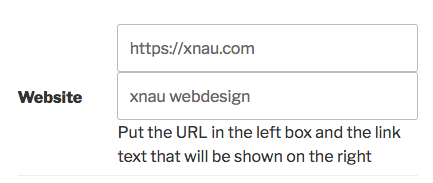
Link Field
This is a special field for defining a link on clickable text. It shows two text inputs which allows the link text to be defined along with the URL. If only the URL is provided, the link text will be the URL.
The provided example will display like this:
xnau webdesign
The Link field has several options that can be set in the “attributes” parameter:
- placeholder – this text will be the placeholder in the clickable text input of the element, overriding the default “Link Text”
- url_placeholder – this text will be the placeholder in the URL input of the element, replacing the default “(URL)”
- hide_clicktext – this attribute will hide the clickable text input and prevent the user from setting the clickable text of the resulting value display. If a “default” value is defined for the field, it will be used as the clickable text. If no default is define, the clickable text will be the provided URL, minus the protocol. i.e., “https://xnau.com” will use “xnau.com” as the clickable text.
Image Upload Field
This provides an upload field for an image file. The allowed types and maximum file size are determined in the plugin settings (General Settings tab, “File Upload Limit” and “Allowed File Types”).
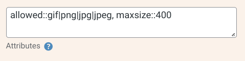
You can also set the allowed types on a per-field basis by adding an “allowed” attribute, separating the allowed file extensions with the pipe | character. Note that the extension must match exactly, and it must also be enabled in the global setting.
As shown, you can also use the “maxsize” attribute to limit the file size. The number represents the number of kilobytes…so 400 means 400k.
Note that limiting the file types is not a security feature, the files are not tested to make sure they really are the right type, it only looks at the filename extension.
All plugin uploads will be stored in the location designated by the “File Upload Location” setting. In almost all cases, the default setting is a good one to use. Only change this if you know what you’re doing and know where your files will end up. If you change this after files have been uploaded, the plugin will no longer be able to find them unless you move the previously uploaded files to the new location.
Enhanced image upload capabilities are available using the Image Expansion Kit add-on. This add-on is highly recommended if your application gets lots of uploads from users, as it gives you better ways to manage uploaded files.
File Upload Field
This provides a general file upload control. Any file type appearing in the “Allowed File Types” setting (under the General tab) will be accepted as long as it is under the maximum file size. The accepted file types and maximum file size may also be defined on a per-field basis as described in the Image Upload Field above.
While the standard security precautions are taken with these uploads, if you’re site is not configured correctly, this could lead to a serious vulnerability if malicious files are uploaded to your website where they can be executed.
Hidden Field
This is generally used to store system information not requiring user input, such as an IP number or user name. It can also be used as a way to add a fixed value to a record, or as a convenient way to allow client-side javascript to add a value to the submission. The values stored in hidden fields can be shown only as “read only” values on the frontend.
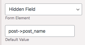
The hidden field has the ability to acquire system values to be saved with the form submission. There are many possibilities, but a simple, commonly used example is collecting the name of the page the signup form is on. This is done by creating the hidden field, assigning it to the signup form, then typing in the code for the value you want to collect. To get the page name, you would use post->post_name in the “Default” setting for the field. When the form is displayed, the name of the page will be filled in to the hidden field and saved with the signup submission.
The objects you can access this way are:
- post (information about the current page or post)
- current_user (information about the current logged-in user)
- SERVER (information about the current state of the web server)
- other php superglobals
- literal string in the shortcode (version 2.0)
More information on configuring hidden fields can be found here.
Numeric
Good for storing numbers, integers only. If you want a field with numeric content to be sorted numerically, you must use a numeric field of some kind (there are 3 available). You cannot store non-numeric data in a numeric field, which means you can’t store a value that has both numbers and letters.
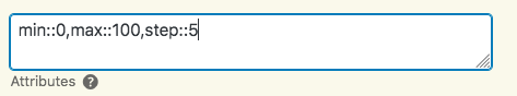
You can set up limits and step values in the field attributes, like this:
This example sets the field parameters so the maximum value is 100, the minimum is 0 (no negative numbers allowed), and each click on the increment control will move the value by 5.
Decimal
Allows for numbers with decimals, defaults to 10 places on the left of the point, and 4 to the right. Also uses the same configuration attributes as in the numeric field.
The “step” attribute can be used to change the number of decimal places shown. For example step::.001 will give you 3 decimal places, step::.1 will give you one.
Currency
Allows for numbers with two decimal places, like most currency values. Currency symbols are not allowed, only the numeric part is stored. Uses the same configuration values as in the numeric field. You can define a currency symbol to be displayed with the number using the “data-before” attribute. For example:
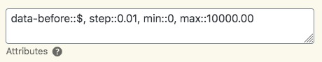
This places a US Dollar sign before the number, limits the increment to one cent, and sets the maximum value of the field to 10,000. Negative values are not allowed.
There is also a “data-after” attribute you can use if you need the symbol to appear to the right of the number.
Password
This is a special-use field for developers so that a hashed password can be stored with the record. The Participant Login add-on can be configured to use a password field to create a secure way for the user to edit their record by entering a password instead of using a private link.
Note that with this field, you will never be able to see what the password is…that’s the whole point of hashing, it makes it difficult to steal the password, all the hacker will get is an indecipherable string.
CAPTCHA
This provides a simple way to include a human test for your form submissions. There is only one type of CAPTCHA provided with the plugin: one that asks the user to solve a simple randomly-generated arithmetic problem.
A CAPCHA field cannot prevent all spam registrations, human-powerd spam cannot be blocked this way, but it is essential for limiting script-driven registrations.
For more robust bot registration prevention, check out the reCaptcha Add-On.
Placeholder
The placeholder field is mainly used to provide a clickable link in list displays. It is a utility field and does not save anything to the database. The Placeholder field can only be created by using the “Add Field” control on the Manage Database Fields page, it is not possible to convert an existing field to a Placeholder field.
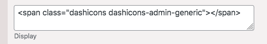
The “Display” setting for the field is the content that is displayed. If the field has a link placed on it (for example if it is designated as the “single record link field”) the content will be clickable.
Some simple HTML is allowed in here. For example, to show a Dashicons icon, you can use a value like this:
Placeholder fields are also useful for placing other links in lists of records when using a custom template, such as adding a link to edit a record, as described in this tutorial: Adding a Record Edit Link to the List Display.
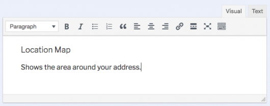
Heading
This is a utility field you can use the help make your forms more readable. All it does is print a block of HTML-formatted text, so you can use it to explain things, or help organize the form (in addition to possibly using Field Group Tabs).
The Heading field is a utility field and does not save anything to the database. It can only be created by using the “Add Field” control on the Manage Database Fields page, it is not possible to convert an existing field to a Heading field.
This field simply displays the content of the “Heading” attribute of the field definition. For example:
Controlling where the heading field is seen is a little complicated. The field is shown by default when the record is displayed using the [pdb_single] shortcode. To show the field in other situations, you will need to configure it in the field definition on the Manage Database Fields page. This chart shows how the different configurations work:
| Field Attribute Setting | [pdb_signup] | [pdb_record] | [pdb_single] |
|---|---|---|---|
| (none) | shown | ||
| (signup checkbox) | shown | ||
| “pdb_record” attribute | (signup checkbox) | shown | |
| “pdb_single” attribute | (signup checkbox) | shown | |
| “pdb_single” and “pdb_record” attributes | (signup checkbox) | shown | shown |
To set the “attribute” put the value into the attributes setting for the heading field. For example, to have the field show when showing an editable record, put “pdb_record” into the attributes setting. To enable it in both the single record and the record edit screens, put “pdb_record,pdb_single” into the attributes setting.
This field type does not present your users with a place to type something in, you would probably use a “Rich Text” field for that.
Media Embed
This form element shows an embedded video or other hosted media, using WordPress’ built-in media embedder. The value of the field must be the full URL to the media itself. The linked article explains this in detail and provides a list of supported sources, it’s really worth reading to understand how this field works.
This field type can also simply display an externally-hosted image. If the the value of the field is the absolute URL to an image file, it will display the image.
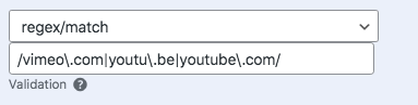
It is suggested that you explain to your users exactly what is expected. If you want to restrict the input to particular source or set of sources, you can use a regex validator to enforce a URL from a specific host or hosts, file type, etc. You will need to understand how to use regular expressions to use this feature.
String Combine
This is a form element that displays a combination of values from the record. To set this up, the field definition uses a “Template” that determines which values are used to make up the displayed string.
The classic example of this is a field that combines the first and last names into a single field. For that, you can use a template like this:
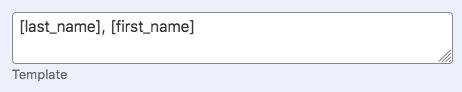
Which results in an inverted order name like this: “Barker, Roland.” The way this works is like other text templates in Participants Database, the bracketed “value tags” are replaced by the record’s value of the same name. If the value is missing or blank in the record, the value tag is removed from the display.
The resulting string is also saved to the database, so it can be used in search and sort procedures.
To have the String Combine field value set when the Signup form is used, you must enable the “Signup” checkbox on the field definition. Any fields that are in the field’s template must be included in the signup form. The String Combine field will be added to the signup form as a hidden field.
It is possible to define a default value for the field, which is displayed if all the fields in the template are blank. This is done in the field Attributes with a setting such as this: default::no name
If all of the value tags in the template are empty, the generated string will be blank. If data for a field in the template is missing or blank, it will be omitted from the generated string, but the rest of the string will be generated. If you want to prevent the string from getting generated if any of the field values are missing, use the “complete only” directive in the attributes, like this:

Numeric Calculation
(version 2.0) This field provides a way to present a value calculated from other values from the record. This is similar to the String Combine field in that you will configure the “template” that is used to make the calculation, and then the resulting value is saved to the database.
The template for the Numeric Calculation field works by using value tags to represent specific values in the record. Operators are used to set up the calculation that is performed, and then finally, the format of the displayed value is determined by a special formatting tag.
Calculation fields are always “read-only,” meaning they cannot be changed by the user, but they are usually based on other fields that the user can change.
In depth details will be found here: Calculation Fields
Date Calculation
(version 2.0) Works in very much the same way as the Numeric Calculation field, only it’s designed to specifically work with date and timestamp fields where the result is also a date. This field provides a string-searchable date…for example to find all matches in a specific month or year.
More information here: Calculation Fields
Shortcode Field
This field type is for displaying any shortcode. To configure the field, place the shortcode to be displayed in the “Shortcode” setting for the the field. To insert the field’s value into the shortcode, use the “%s” token.
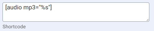
This example creates a field that will show an audio player for the linked mp3 audio file using the built-in WordPress audio shortcode. The field stores the URL to the audio file, which must be publicly hosted on a server, and displays a player for the audio. You can use a “regex” validation to enforce a specific file type.
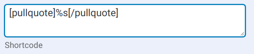
You can also use it to place “wrapped” content, for example:
There are two options you can enable for this field type: “preview” which affects how the field is displayed when editing the record. If “preview” is set as an attribute in the field definition, the field will show a preview of the shortcode’s display. The “show_value” option is applied when the record is getting displayed using the single record display. When “show_value” is set as a field attribute, the URL will be displayed along with the shortcode’s display.
You can potentially put any shortcode in here, but shortcodes that generate formatted output may not fit into the display correctly. Shortcodes that have big, complex outputs may not work well or at all. It’s not really meant for that, but you can try it. Using a Custom Template can help if this is what you want to do.
What if the display shows nothing? If the shortcode does not get processed, the field will display a blank (instead of showing the broken shortcode). This can be because the plugin that adds the shortcode is disabled, or there is some kind of syntax error in the shortcode setting for the field. Make sure you understand how the shortcode works and what it expects for the dynamic value. If inserting the field’s value into the shortcode causes a syntax error, it could result in the field displaying nothing. A good example of that is if the field’s value contains a double quote, that will often result in a syntax error.