Description
With this add-on you can begin using HTML5 input elements in your Participants Database forms. These input elements offer several advantages over the standard inputs, and are especially useful to mobile and tables users because it interactively provides the best input tool for the field. These elements can improve the user experience of your forms by providing a more intuitive interface for entering things like phone numbers, email addresses, URLs and more.
The new form elements are:
- Telephone
- URL
- Email
- Color Picker
- Range Slider
- HTML5 Date (limited browser support)
HTML5 also introduced browser-based client side forms validation. When you add the “required” attribute to a field, the field will be validated by the browser before the form is even submitted.
This layer of validation works well with and conpliments the plugin’s built-in validation methods. If you need a more complex validation (such as using a regular expression or field matching), the form submits and Participants Database applies it’s validation to the fields that can’t be validated in the browser.
If you’ve got some Javascript skills, this plugin works seamlessly with popular jQuery validation plugins to give your users a complete client-side validation experience. Using jQuery-based client-side forms validation makes your forms easier and faster to fill out and is the only way to achieve conditional validation where some fields are only validated given the state of other fields.
Instructions
The plugin is very easy to use: just activate it and the new form elements become available in the “Form Element” dropdown of the field definition on the “Manage Database Fields” page of Participants Database.
Some of the new form elements use attributes to modify their behavior. These attributes can be set in the “values” field of the form element definition and uses the same form as other fields that make use of the “values” parameter. I’m detailing this for each field type below.
Telephone
This form element is primarily of benefit on touchscreen devices where a special input is activated, making it much easier for the user to enter a phone number. There is no input validation, so basically anything can be entered here. You can, of course, add validation via the field definition in Participants Database. This field does not have any special attributes.
URL
This field type provides native browser validation enforcing a valid URL. For touchscreen devices, this field gets a special keypad that includes some helpful shortcuts. This field does not have any special attributes.
Email
This form element type enforces a valid email for it’s input and for touchscreen devices, uses a modified keypad with shortcuts for entering an email address. The email input accepts the “multiple” attribute, allowing it to validate multiple comma-separated email addresses.
Color Picker
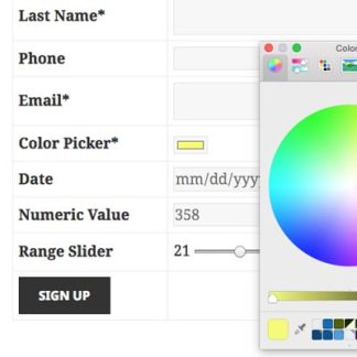
If you need the user to select a color, this is the way to go. It produces a native browser color picker (yes, forget trying to style it) so finding a color and entering it is a snap. It saves the color as a hex RGB value. The product image shows the color picker in Chrome for Mac. It will look and behave differently depending on the OS, device, and browser used.
Range Slider
This neat little control my not have much use in the usual form, but it’s really good at what it does: allow the user to select a general (not exact) value using an input slider. The slider can be set to have a minimum and maximum value using attributes. You can set that up like this in the field definition:
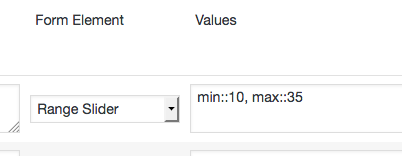 That sets the minimum values of the slider to 10 and the maximum value to 35. The attributes this element uses are:
- min – sets the minimum value that can be set
- max – sets the maximum value
- step – sets the increment used when moving the slider…this defaults to 1
HTML5 Date
This sets up a special HTML5 date field. This field doesn’t have any type of validation. On many platforms, a native date picker is available, but it is notably absent in Firefox, so this form element has limited usefulness without some kind of javascript datepicker to use as a backup. This is provided by the “Datepicker” add-on to Participants database.
This field type does make use of attributes: you can set the earliest and latest date that can be entered, but it only works for the datepicker. The user can directly enter any date they want. If you want to use the attributes, they accept a date for their value. for instance to only allow dates for the year 2016, you’d use a values string like this:
min::jan 1 2016,max::dec 31 2016
Note that commas can’t be used in those values.
Numeric
Participants Database included the HTML5 “Numeric” field type a while back. It uses the same attributes as the slider control: min, max, and step, and enforces a number as it’s input.
Setting Attributes
Filed attributes are set using configuration string in the “values” parameter of the field definition on the “Manage Database Fields” page in Participants database. The configuration strings are written as comma-separated name::value pars. For instance the Range slider can be configured like this:
min::1,max::100,step::0.1
To limit the range to 1 – 100 in steps of 1/10.
You can use the “values” field to add any other attributes you want to use:
multiple::multiple
To set the multiple attribute.
One of the benefits of using HTML5 Input elements is you will get automatic client-side form validation. This means that instead of submitting the form to find out that something is missing or wrong, the form tells the user right away and helps them fix the problem before the form is actually submitted. This functionality is provided by the browser (that’s what “client-side” means), so it will look and behave differently depending on the platform, device and browser in use.

The way this works with Participants Database form validation is all your fields that you want validated in the browser must be marked as required in the form by adding the “required” attribute. This triggers the client-side form validation.
If the input is an “email” or “url” type, it enforces a valid input for that type. If the validation is of a type that can’t be validated in the form, or of the browser in use doesn’t support HTML5 client-side validation, it submits the form and lets Participants Database finish the validation. For instance, if you are using a “regex” or “match” validation in Participants Database, the validation on those fields will take place when the form is submitted.
Pattern Validation
HTML5 introduces an attribute named “pattern” that does allow you to set up client-side validation using a regex expression. To use this feature, set your field validation in Participants Database to “Required” and then in the “values” section of the field definition, set up your pattern. The regex in the pattern attribute does not use delimiters or modifiers, as specified here.
For example, if you wanted to enforce a specific pattern for a phone number, you can set up the pattern attribute to make sure the user enters it exactly the way you want. If you want the number to conform to the US standard: xxx-xxx-xxxx you would do that like this:
[0-9]{3}-[0-9]{3}-[0-9]{4}
Also, it’s a good idea to tell the user what you expect. You can use the “help” text for that, but you may want to use the ‘title’ attribute to get the message across in a subtler way. To set all this up, put something like this in the values parameter of your telephone field:
pattern::[0-9]{3}-[0-9]{3}-[0-9]{4},title::phone number must include area code: xxx-xxx-xxxx
This gives you a lot of flexibility in setting up your client-side validation without any javascript at all!
Further Reading
To learn what is possible and more about how the HTML5 input tags work, take a look at these references:


 That sets the minimum values of the slider to 10 and the maximum value to 35. The attributes this element uses are:
