The Manage Database Fields Interface
In the admin menu, under “Participant Database” you will see the link to the Manage Database Fields page. Click that link to begin.
All your database fields are defined on this page. This is where you can add or delete database fields from your configuration, or edit the configuration of individual fields.
Each piece of information stored in the database is stored in a “field,” and there are many different kinds of fields (called form element types) that are used to store information in various ways. The different form elements present specific user controls such as text fields, dropdowns, radio buttons, etc.
Field Group Tabs
At the top of the page is a series of tabs. Participants Database fields are organized into groups, and each tab (except the last two) represents a group of fields.
The last two tabs provide access to edit field groups and provide a quick help page.
Field Definitions
Below the field group tabs is the list of fields defined for the currently selected group as shown in the screenshot above. Each line represents one field, and in this view, the fields can be re-ordered, deleted, and selected.
Open/Close the Field Editor
At the far left of each field there is a chevron iconto open and close the field editor. When the field editor is open, all the parameters of that field may be edited. Closing the editor gives you a simple, compact display. At the top is the “Open/Close All” button…click that to set all the fields to open or closed. See below for more about editing an individual field.
Re-Ordering Fields
You can change the order of the fields by click-dragging the blue “up-down” icon and moving the field into a new position.
Deleting Fields
Individual fields can be deleted by clicking the red for the field you want to delete. Multiple fields can be deleted at one time by selecting the fields you want deleted and using the “with selected” action to delete the fields.
Selecting Fields and “With Selected” Actions
Each field has a checkbox on the left where fields can be selected to perform operations on multiple fields.
When one or more fields are edited, the “with selected” control is visible so the operation can be selected. Click “Apply” to perform the operation.
Operations available in the core plugin:
- Delete
- Assign Group
- Add/Remove Signup (determines if the field is included in the signup form)
- Add/Remove CSV (determines if the field is included in a CSV export)
Editing a Field
With the field editor open, the parameters of the field can be edited. (shown in the screenshot above) The parameters that are available for any field depend on the “Form Element” type for that field.
Field Parameter Descriptions
- Name – this is set when the field is created and can’t be changed. This name is used for all configuration references (such as shortcode attributes) to the field.
- Title – This is the label for the field, and can be changed at any time. It is what will be shown to the user.
- Group – every field belongs to a group. You can change which group a field belongs to by changing this parameter. You should update the fields after changing this so that the field can be moved to the new group.
- Form Element – this is the form element type of the field: it determines what element is used to represent the field in a form, how the data is stored in the database, and can also determine other functionality for the field.
- Options – for form elements that need a list of options, this parameter provides the place to define all your options. Take a look at the Field Options section for details.
- Attributes – this provides a space to set custom HTML attributes for the field. There are many possibilities here, this is an advanced feature and you will have to know something about how the HTML works to use this. There are many examples in the instructions and tutorials.
- Validation – this setting determines whether the field is required and can also determine what inputs are acceptable for the field.
- Validation Message – provides the custom message that is shown if the field does not validate. If this is blank, a generic message will be shown.
- Default Value – if the field is supposed to be pre-set with a value, set that here.
- Help Text – when used in a form, this is text that is shown next to the field to provide user help specifically for that field.
- Signup – when checked, the field is to be included in the signup form.
- CSV – when checked, the field’s data is to be included in a CSV export. Has no effect on CSV imports.
- Read Only – when checked, the field can only be changed by an administrator. Read-only fields are always editable in the Signup form.
- Sortable – the field is available in list sorting controls.
- Persistent – the field’s value will be carried over from the previous record when editing or creating a series of records in the admin.
Changing the Form Element of the Field
The Form Element setting determines how the field will be displayed in a form and how the data is stored in the database. The form element types that are provided with Participants Database are described here…
Generally speaking, it is best to avoid changing the form element of a field once data has been collected. You will be warned if you try it, and you should understand the impact on the stored data: it is possible to lose data stored in a field if you change its form element. This is explained in detail here…
Field Options
Certain kinds of fields require a defined list of values (known as options) for the user to choose from. This includes dropdown selectors, radio buttons, checkboxes, etc.
Field options are defined in the “Options” setting with a comma-separated list of values.
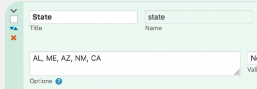
For example if you had a “State” selector, putting AL, ME, AZ, NM, CA in the Options parameter would give the user a choice of those five US states.
Option Labels
It’s also possible to use labels (or “value titles”) for your options. To do that, set your options like this:
Alabama::AL, Maine::ME, Arizona::AZ, New Mexico::NM, California::CA
For each pair, the first string is used to display the value to the user, while the second is what will actually be stored in the database. Note that spaces are allowed, but leading and trailing spaces will be removed. You can also put simple HTML tags in your value titles.
The value title is also filtered for translation, so that you can show your values in different languages, while the value that is saved will be the same for all languages.
Special Characters in Option Labels
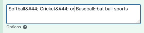
You can use any literal character in an option label except a comma. This is because the comma is used to delimit each option. The way around this is to use the HTML entity for the comma: , See the example to the right.
That would display as: Softball, Cricket, or Baseball
Although you can also place punctuation in the option value, I wouldn’t recommend it, it could cause problems and it’s probably not necessary.
It is also possible to put simple HTML in an option label, for example, a link.
<a href="https://greendot.com">Green Dot</a>::green, <a href="https://reddot.com">Red Dot</a>::red
Only simple HTML will be allowed here, things like a span (if you want to give the title a special class) or bold, italic, etc. You won’t be able to use any tags that are not allowed inside of a label tag.
Checkboxes
Checkboxes only need one value, which is what will be saved if the box is checked. If the box is unchecked, nothing will be stored in the field value.
If there are two values, the second value will be saved if the box is unchecked. For example: Yes,No will save “No” if the checkbox is not checked.
Option Groups
For really long lists of values, it is possible to group them by adding a group title which can be added using a label with a value of “optgroup.” Here is an example of a list of options that are organized with optgroups:
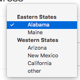
Eastern States::optgroup,Alabama::AL,Maine::ME,
Western States::optgroup,Arizona::AZ,New Mexico::NM,California::CA
This can help the user find the option when there is a lot to choose from. Each group is wrapped in an HTML element so that it can be styled as a group.
The “Nothing Selected” Option
It’s also possible to define the “nothing selected” option. This is an option that essentially clears the value of the field. It is also used as a prompt that is shown by default, but does not save a value if the record is saved like that.
To set that up, put something like null_select::Choose… at the beginning of the list of options. It must have the “null_select::” part, the part following the :: is what will be shown in the selector and that can be anything you want. If the field is required, the null select will not validate, forcing the user to make a real selection.
In some cases, you may want to prevent the null select option, which you can do with null_select::false
Determining the Default Option Selection
If there is a “default” setting for the field, that will determine which option is selected by default. There is a dropdown selector labeled “Default Value” to select one of the options as your default selection.
If there is no default defined, but a “null select” has been defined, the null select will be selected by default.
If neither a “null select” or default value has been defined, the first item on the list will be chosen by default. It’s a good idea to have either a null select or default defined for all dropdown fields. Null selects can also be used to give users a way to select “none,” but you can’t make such a field required. If you want to force them to make a selection in a field where “none” is an option, just add an item with the value “none” to the field values.
Selectors with an “Other” Option
Some types of selector will allow the user to type in a value that is not present in the list of options. If they select “other” they can type their value in to the text input provided for that purpose.
The “other” selector that can be named by adding an item specifying a title for the “other” value. For example: Something Else?::other.
Note that for multi-select selectors, only one “other” value can be stored.
Exclusive Options
As of Participants Database version 2.5.8 you can designate the options of a field to be exclusive, meaning that the option cannot be selected if it has been selected in another record.
To designate a field’s options as exclusive options, add the “exclusive” keyword to the field attributes, like this:

Field Attributes
This is an advanced setting for situations where you want to customize the behavior or appearance of the field.
To set an HTML attribute, type in the name of the attribute, paired with the value using a double colon to separate the two, like in this example when you want the link on the field to open in a new tab:
target::_blank
In the displayed HTML, that will include a target="_blank" in the element.
To define multiple attributes, separate each attribute pair with a comma, like this: (this example can be used to configure a numeric field)
min::0,max::100,step::1
You can do this with any HTML attribute, but it’s important to remember this is a complex functionality and you may need to consult an authoritative source to understand how to use it.
Commas in the Attribute Value
If you need to use a comma in an attrribute value, you can’t put it in literally, but you can do it using an HTML entity. The entity for a comma is “,” so, if you have an attribute that needs a comma, do it like this:
placeholder::right, center, and left
This will show the placeholder value as: “right, center, and left”.
Upload File Types
For File-Upload and Image-Upload field types, you can also set the allowed file extensions here with an entry like this:
allowed::txt|doc|docx
That will only allow files with those three file extensions to be uploaded to that field. Remember that this is not a security feature, it is only used to help the user upload the correct type of file.
Showing Units or Denominations
You can configure a field to show a units or denomination character in the field configuration. This is done in the attributes setting for the field, using the “data-before” or “data-after” attributes. For example, to show a currency field with a US dollar sign before it, use an attribute like this:
data-before::$
Field Validation
Any field that gets user input can be validated. The validation setting sets the type of validation to use.
- Required – the user is required to type something into the field or make some selection.
- Email – the user must type in a valid email address.
- CAPTCHA – only available for the CAPTCHA-type field, validates the user input.
- Regex/Match – this selection requires an additional value: either the regex pattern to use or the name of a field to match.
The “Match” validation is used to verify user input by making them repeat it. A common example is an email address: set up two text inputs for the email address: one is the normal field used to hold the email address, the second is a check. On the second field use “regex/match” validation and put the name of the first field in the parameter. This forces the second field to match the first.
Regex validation allows for a very flexible validation for specific values. It is a fairly technical subject, but I have provided a guide to help your through it: Using RegEx Validation
Validation Message
Each field can have a message that is shown if the field does not validate. If provided, this message overrides the global validation message that is defined in the Participants Database settings.
Adding A New Field
At the top of the list of fields is the “Add Field” button. Clicking that button the opens the Add Field form where you type in the Title of the field and the form element. The name of the field will be based on the title. That name can’t be changed later, but the title (which is the visible label for the field) can be changed at any time.
Because the “name” can’t be changed, you may want to use a short title to create the field. That will give you a simple, short field name, and you can change the title to something longer later.
After you type in your field title, select the form element type to use, then click the blue “Add Field” button to add the field. Once added, you can complete the configuration of the field by opening the field editor for the new field.
Recovering Deleted Field Data
When a field is deleted, the data that was stored by the field is not deleted from the database. What is deleted is the definition of the field itself. This means that you can recover data from an accidentally-deleted field by re-creating the field.
In order to do that, you must give it the exact same name as the field that was deleted. You can do that when creating a new field, just enter the name (not title!) of the deleted field and select the same form element type as the old field. A new field will be created that will assume the data in the main database.
Field Groups
All the database fields are part of a field group. The purpose of field groups is to help organize your fields into logical sections (this makes a better interface for your users) and also helps you manage the fields when there are a large number of fields.
Field groups are also how you control the visibility of fields, as explained below.
Field groups are managed under the “Field Groups” tab on the Manage Database Fields page:
Field groups have a View Mode setting that controls the visibility of the fields it contains. Here are the settings explained:
- admin – only administrators can see these fields
- private – the fields in a private group can only be seen by admins and in the frontend record edit display
- public – fields in a public group can be seen by anyone.
It is important to understand that content visibility is also controlled by WordPress, so for instance, public groups can only be seen by the public if you place a plugin shortcode on a publicly-visible page.
Field visibility can be overridden in the shortcode by using the “fields” attribute.
The “Record Info” group is special, it can’t be deleted, and stores metadata about the record that is set by the plugin when records are created and updated.
The Record Info Group
The Record Info group contains utility fields that are necessary to each record. These fields cannot be deleted or moved to other groups. You can change the name of the fields if you want, and they can be selectively included in CSV exports and sorting operations.
The core fields found in this group are:
- Record ID – holds the numeric id of the record
- Private ID – holds the private access key for the record
- Date Recorded – timestamp set when the record is created
- Date Updated – timestamp for the last time the record was updated
- Last Accessed – sets a timestamp when the record is accessed for editing on the frontend
- Last Updater – holds the user login of the last user to update the record
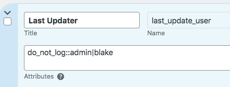
The Last Updater field records the user login of a logged-in user that updates a record, giving you a way to know who made the last edit. It can be configured to ignore certain users. This is done in the attributes setting for the field with the “do_not_log” attribute. The list of usernames should be separated with a pipe | character.