Description
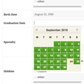
The add-on provides the easiest way for your user to choose dates and enter them into your forms. The datepicker is configurable so that you can limit the range of dates available to the picker. A selection of themes is available to help match the datepicker with the look of your site.
The datepicker comes pre-set for smooth, responsive operation with all platforms, including mobile devices.
Instructions
The Datepicker is easy to set up, just install and activate. The default settings will place a pop-up datepicker on all your Participants Database date fields automatically, in all frontend and backend forms.
Probably the first setting you’ll want to adjust is the “Datepicker Theme” which determines the appearance of the datepicker. It does this by loading a theme file from an external source. The theme selector dropdown chooses a theme from the default set of themes available from jQuery. To see what these default themes look like, visit the jQuery UI Theme Gallery. On that page, you can also create your own theme, using one of the default themes as a starting point…but be warned, it’s a little complicated. I offer some guidance on how to set that up on the product support page. See the Settings tab for more detailed setup information.
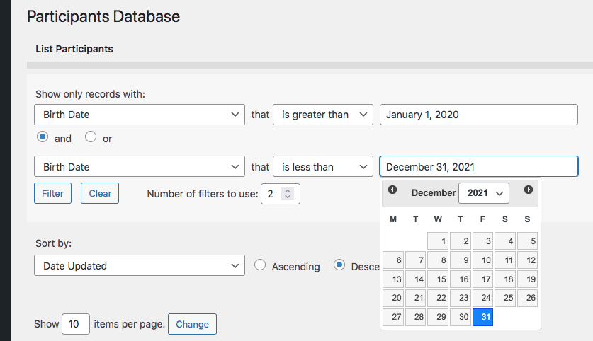
Datepicker now places datepickers on search inputs on the admin List Participants page. When a “date” type field is selected as the search field, a datepicker is placed on the input. To search for a range of dates, you must use two filters, for example:
Settings
Datepicker Theme
Selects the appearance of the datepicker from a set of default themes provided by jQuery.
Normally, this uses the general date format of your site, but you can set it to something different here if you want.
Refer to this page for the full list of codes you can use here: php date format.
Earliest Date Limit, Last Date Limit
Sets the global date limit for all datepickers. This can be set on an individual basis in the field definition. Both “date limit” settings prevent the datepicker from selecting a date outside of the range specified by these settings. You can set one (minimum or maximum only), both (defines a range of acceptable dates) or niether (no limit to the date that can be selected). These settings can be overridden on individual date fields by using a configuration string in the “values” parameter (Manage Database Fields page). Something like: minDate::jan 1 2016, maxDate::dec 31 2017 would effectively prevent the selection of any date outside of the year 2016. NOTE: do not use commas in your dates, it will confuse the parser. It’s also possible to define the date limits as years only by using the ‘min’ and ‘max’ attributes, like this: minYear::1972,maxYear::2010
Advanced Settings
These settings will requires some technical knowledge to make use of. Be careful with these: you can break the plugin with an incorrect setting.
Datepicker Selector
This is the CSS selector used to place the datepicker. For instance, you can use this to target specific date fields if you didn’t want others to have the datepicker.
Additional Configuration Settings
This gives you advanced control over the datepicker on a global basis. This must be a properly-formatted Javascript object. See the jQuery Datepicker API for what you can do with this.
jQuery UI Theme Stylesheet
This is the URI of the UI theme stylesheet. This is set automatically by the theme selector above. If you want to use a different UI Theme, you can put the full URI to the stylesheet here. A path relative to the theme content root will work here too. If your WordPress theme has a jQuery UI theme configured, leave this space blank, so the WP theme can style the datepicker for you. Creating your own theme: I have an explanation of the process on the Datepicker product support page.
Product-specific technical support can be found here:


Frank Graziani (verified owner) –
Cool and stylish upgrade for picking dates in date fields!